Autumn-Winter 25-26 Color Review : A Season of Contrasts The - Automne-Hiver 25-26 - Colors
Every meeting of opposites is a celebration of diversity – and a chance to uncover the harmonies in their coexistence.
The Autumn Winter 25-26 season is marked by polar opposites, inviting us to combine their contrasts and embrace their differences.
The Multiple Contrasts found in the season’s color choices explore extreme visual impact – a bold black and white for example – or channel a sophisticated subtlety. Harmonies seek an overt contrast between two or more combined shades. In warm/cold and light/dark contrasts, the nature of each hue is emphasized by its difference with the other.
With Sensory Opulence, the season’s harmonies strike a balance between an urge for understatement and a powerful longing for luxury. It’s a dialogue between color and material, targeting the delicately nuanced balance of minimalist excellence.
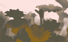
Post-Romantic palettes, for their part, combine the range’s soft, neutral and grayish hues with transitional colors recalling the infinite nuances that lie between two opposites. Whether played in hazily blurred shades, in gradients or sophisticated decoration, these shades merge and diffuse, with little contrast or just lightly set off by darks.
In the spirit of Visible Pasts, colors enhance the beauty of wear, for fashions that espouse longevity. Colors and craftsmanship work together, merging time frames and reconciling the past with modernity. Compositions that invite us to rethink our relationship to clothing, for a quality wardrobe that lasts through the seasons. Faced with the challenges of sustainability, the inherent beauty in deterioration becomes a key asset.