AW 25-26 Color Range Preview : The Power of Contrast The - Automne-Hiver 25-26 - Colors - Première Vision Paris
The Autumn Winter 2526 color range illustrates both the powerful contrasts giving life to the season, and the multiplicity of shades.
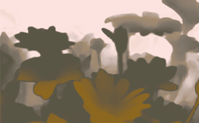
Revealing the richness and complexity behind each shade, the color range forges connections between strong intensities and soft tonalities. It is built on variations of muted, sophisticated hues: blues, browns, purples and greens are modulated, lightened, grayish to the point of being blackened, darkened. Shades that are rooted in the reality of the many stages in the life of a fashion-industry product.
Light, slightly grayish or muted hues reflect how today’s techniques and materials are evolving, with shades derived from recyclings, second-hand products, a conscious decision to use less pigments, or from washings, wash-outs, and patinas.
Darker tones, for their part, look likely to evolve and grow more nuanced over time, without losing any of their appeal.
These are chromatic choices that propose color as a way to break down barriers, bridging different time frames, connecting genders and uses, and adaptable to any style universe.
A season of multiple contrasts
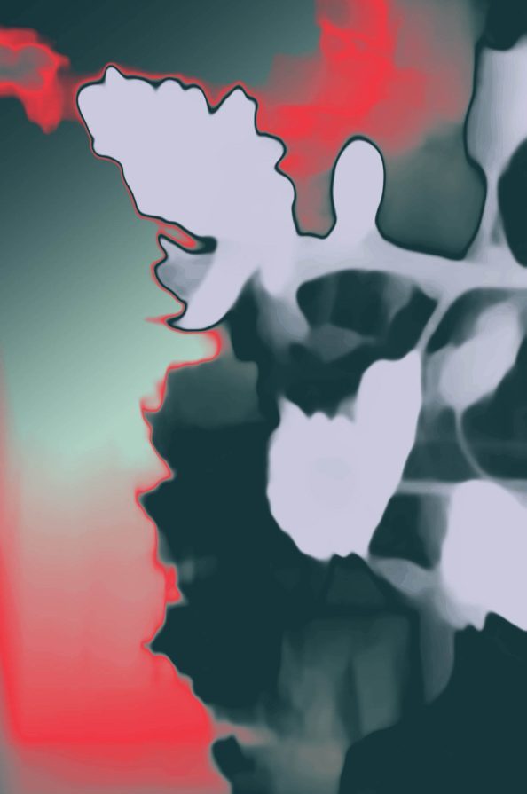
Autumn-Winter 25-26 is a season of contrasts. The palettes generated by the color range explore the coexistence of opposites. Chromatic clashes are updated in highly sophisticated versions. Colorful plays on polarities – between the real and the unreal, comfort and dynamism – pave the way to versatile uses.
Accumulated contrasts
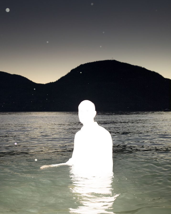
Absolute black and optical white are added to the color range, boldly complementing it, to enrich or underline contrasts. In dialog with color, blacks and whites empty out harmonies, sharply contrasting with multi-colors, to simplify patterns and heighten their impact. Opposites are accumulated within the same composition, and complementary colors, warm-colds, light-darks are all brought together for a maximal effect.
Blacks and whites are also replayed in colored versions, for new, reappropriated chiaroscuros. On silks, lace, and embroideries, contrasts grow more intense thanks to an interplay of textures and shines, particularly in jacquards, thanks to prints poised in the textures of motifs.
Utilitarian & Sensual
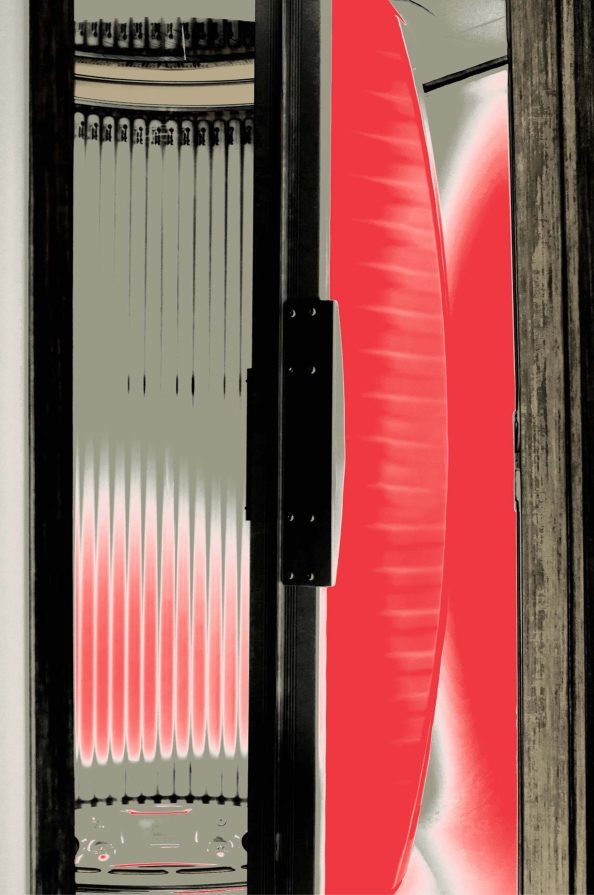
Classic red and black, a chromatic contrast with a high degree of intensity, is revisited this season. Reinterpreted with even more nuances, composed of softer tones or accompanied by neutrals, this iconic duo steps into a refined, elegant register.
Worked in color blocks, these harmonies underline the power and intensity of red, for an appealing palette right for a gender-neutral wardrobe, for outerwear, citywear, chic cottony pieces or even high-end leather items. Following the trend of the last few seasons, everyday and practical wardrobes are growing more sophisticated, with shades reflecting the return of chic workwear.
Come discover the 29 colors of the Autumn-Winter 25-26 range at Première Vision, next 2, 3 and 4 July, at the Parc des Expositions de Villepinte.
The AW 2526 PV Color Book will be on sale as of 2 July 2024 at THE PREMIÈRE VISION PARIS SHOW and online as of 8 July 2024.
Discover the new season’s guiding themes and ideas in our «Autumn-Winter 25-26: The Season’s Theme revealed in a New Teaser » article.